

Big-Ass Numbers (BANs): Why They Belong on Every Dashboard
KPIs that pop. Metrics that matter. Make your numbers loud, proud, and crystal clear.

The Real MVPs of Every Dashboard
Every dashboard has a few numbers that truly matter and tell you where things stand. Are we winning, slipping, or growing strong? These are your real MVPs, the Most Valuable Pixels.
But here’s the catch. In many dashboards, these important numbers get buried. They hide inside tables, get lost under filters, or get squeezed into a corner. That’s where Big-Ass Numbers (BANs) come in.
They don’t whisper, they shout what really matters
So, What Are BANs?
BANs are big, straightforward numbers that show the key metrics your audience really needs to see. For example:
🟢 ₹5.2 Cr Revenue
🔻 3.4% Churn
🟠 74 NPS
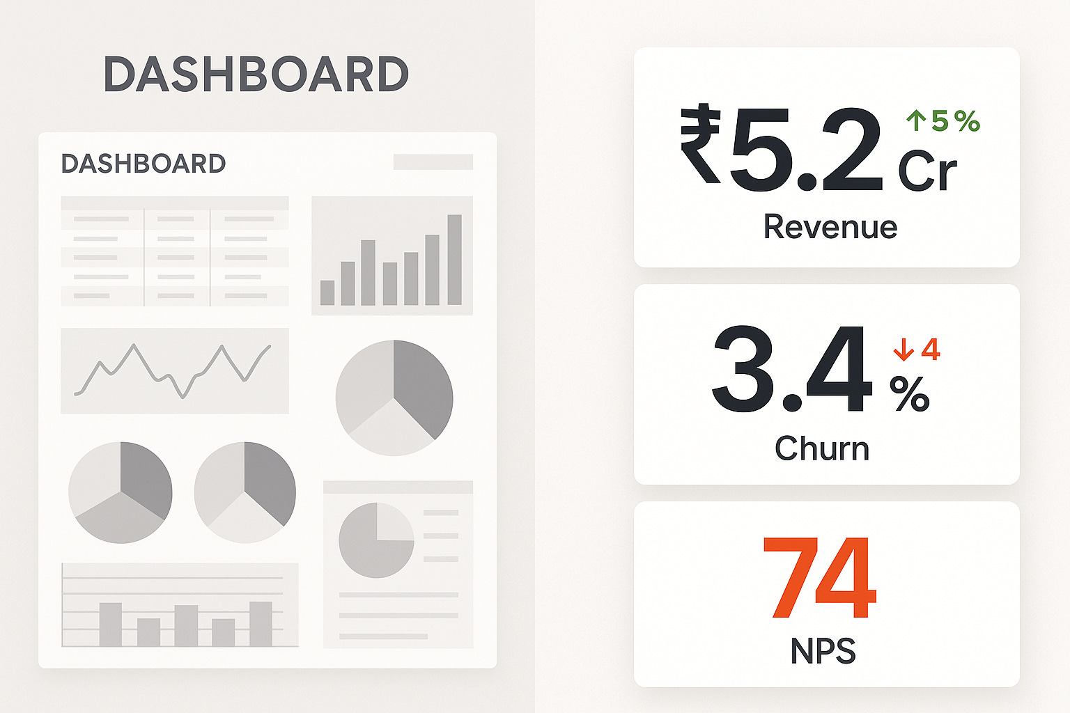
They’re clean, clear, and impossible to ignore.
Usually, you’ll find BANs as separate tiles or cards—just the number, a simple label, and maybe a small icon or color to show trends. No clutter, no extra noise.
To clarify, KPIs (Key Performance Indicators) are the important metrics you track to measure success. BANs are simply a way to display those KPIs boldly and clearly so they catch your attention immediately.
Why BANs Work (And Why You Should Use Them)
1. Quick to Understand
Our brains catch big, bold numbers faster than we read charts or go through tables. That’s called preattentive processing. So with BANs, people understand what’s going on almost instantly.
2. Like Headlines in a Newspaper
Think of a newspaper, the main headline is always bold and upfront. BANs do the same job for dashboards. They grab attention and tell people what matters right away.
3. Set the Stage
Before you go into trends, filters, or deep dives, BANs answer the basic question, “Where do we stand right now?” They help set the tone for the rest of the analysis.
4. Useful for Everyone
Whether you’re a CXO, product manager, or analyst, everyone appreciates clarity. BANs speak to all levels without needing extra explanation.
Where Should You Place BANs?
Use the one-third rule (you might remember this from our earlier blog):

Top-left or centre-top—this is prime dashboard real estate.
Group 3–4 KPIs at max—less is more
Maintain consistent sizing and spacing—let your BANs breathe
Good BANs Aren’t Just Big, They’re Smart
Big-Ass Numbers (BANs) are like billboards. They must grab attention and guide action. Here’s how data professionals keep BANs smart, not superficial:
Clarity
✅ Use:
Descriptive labels (e.g., “Monthly Revenue” instead of “Rev”)
Large, legible fonts for immediate readability
❌ Avoid:
Jargon like “MoM Var%” without explanation
Cramped text or ambiguous headers
Power BI/Tableau Style Tip:
Use a Card visual with dynamic text fields and bold titles. Prioritize font hierarchy.
Context
✅ Use:
Up/down trend arrows
Small multiples or sparklines
Comparisons like “vs last month” or “YoY change: +12%”
❌ Avoid:
Showing standalone values like “1.2M” without reference
No time frame or baseline
Power BI/Tableau Style Tip:
Pair BANs with KPIs or time-series microcharts. Add a reference line or delta indicator.
Contrast
✅ Use:
Green for positive change, red for negative (with accessibility-friendly shades)
Muted colors for background context
❌ Avoid:
Rainbow color scales
Gradients and 3D effects that distract
Power BI/Tableau Style Tip:
Use consistent color themes across visuals. Leverage conditional formatting for directionality.
Purpose
✅ Use:
Only the most critical KPIs tied to goals
Tailored metrics for the audience (execs vs ops)
❌ Avoid:
Filling dashboards with vanity or unrelated stats
Presenting 10+ BANs with equal weight
Power BI/Tableau Style Tip:
Use parameter controls or role-based views to keep BANs focused per stakeholder.
Before vs. After—A Quick Example
Before:
Users had to dig through 5 charts just to find revenue.
After:
💥 ₹5.2 Cr Revenue—right at the top, with a subtle ↑ 7.5% YoY trend tag.
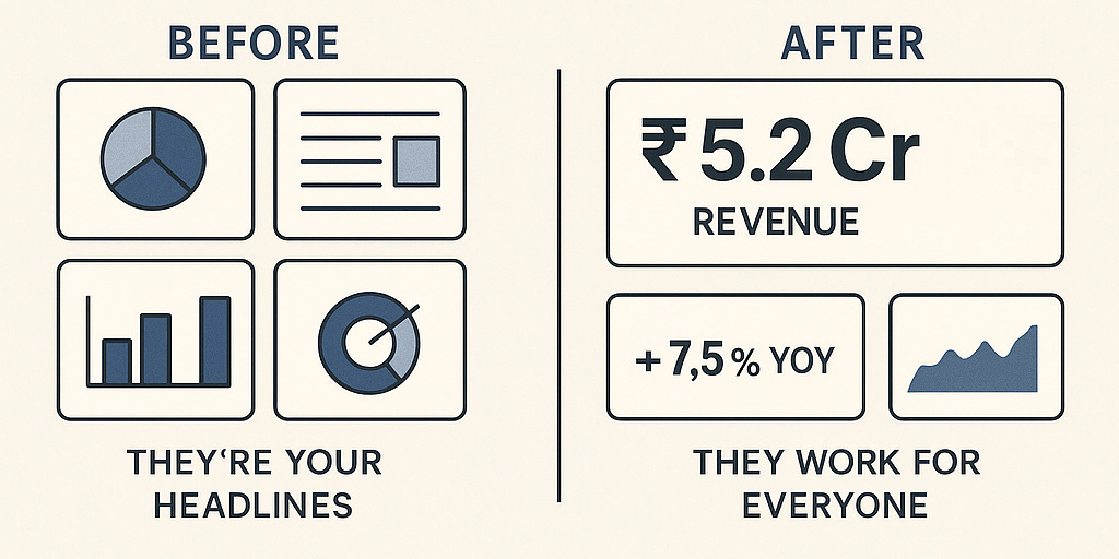
Result? Faster clarity. Sharper focus. Better decisions.
Be Loud About What Matters
Your dashboard shouldn’t be shy. It should boldly declare what’s important.
Think of BANs as newspaper headlines. They’re not just decoration, they’re declaration. Use them with intention. Design them with care.
If users have to hunt for your most important metric, the dashboard has already failed.
The Signature Style of BANs—What Experts Recommend
BANs aren’t just “big fonts”, they are structured, intentional design elements. Here’s what leading dashboard experts say:
1. Size Isn’t Random—It’s Designed
Font Size: 36pt to 72pt is standard
Rule of Thumb: Main number should be 2x to 3x the label size
Spacing: Use 10–15px padding around the tile
Stephen Few (in Information Dashboard Design) insists metrics should be "large enough to be seen at a glance".
2. Minimalism Wins
Use sans-serif fonts like Roboto, Segoe UI, Helvetica
Use color with intent — green for growth, red for drop, grey for neutral
Example Layout:
REVENUE (10pt, gray)
₹5.2 Cr (48pt, bold black)
▲ 7.5% YoY (12pt, green)
3. Where They Sit Matters
Top-left = Most attention
Use a grid layout for symmetry
Keep related charts below for drill-down clarity
BANs in the Books
Information Dashboard Design
by Stephen Few
“Use large fonts, clear metrics, and build a strong visual hierarchy.”
Few emphasizes functional simplicity. BANs should jump out without shouting. This book lays the groundwork for minimalist but effective KPI display.
Storytelling with Data
by Cole Nussbaumer Knaflic
“Guide the eye. Every number must earn its place.”
Cole shares how to design BANs that fit into a story not just look good. It's all about visual flow and context, ensuring KPIs are seen and understood.
The Big Book of Dashboards
by Wexler, Shaffer, and Cotgreave
“Here’s how real teams use BANs in Tableau, Power BI, and beyond.”
With dozens of real-life dashboards, this book shows practical BAN use blending interactivity, relevance, and aesthetics. Great for inspiration and stakeholder-focused design.
BAN Design Checklist (For the Perfectionist in You)
Font Size: 36pt+ for numbers, ≤14pt for labels
Font Type: Clean sans-serif, 10–15px for breathing room
Placement: Top-left or centre-top
Color: Only where it adds context
Limit to 3–4 KPIs
Add subtle trends (YoY, delta) as needed
Bonus Analogy: BANs Are Like Street Signs
Imagine you’re driving at 60 km/h. You don’t want to read a paragraph, you just want to recognize a bold sign and take action. That’s what BANs do. They act like bold, clear street signs on your dashboard’s data highway.
Let your key metrics be seen. Let them be remembered. Let them be BANs.